From Ideation to Perfection: A Comprehensive Guide to the Product Design Process

Product design is a complex and multi-faceted process that involves numerous stages, from ideation and research to prototyping and refinement. A successful product design requires a thorough understanding of user needs, market trends, and design principles. In this comprehensive guide, we will explore each stage of the product design process, from ideation to perfection. Whether you’re a seasoned product designer or a beginner, this guide will provide you with the knowledge and tools you need to create beautiful, functional, and successful products.
The design of everyday products can have a significant impact on people’s everyday routines. Good design can make products more efficient, user-friendly, and satisfying to use, which can make tasks quicker, easier, and more enjoyable.

For example, a well-designed kitchen appliance, such as a coffee maker, can make it easier for someone to start their day by having a cup of coffee ready when they wake up. Similarly, a well-designed transportation product, such as a bike or a car, can make it easier for someone to get to work or run errands.

On the other hand, poor product design can create frustration, inconvenience, and even safety hazards. For example, a poorly designed door handle may be difficult to open, slowing down someone’s entry and exit from a building. A poorly designed medical device can lead to errors and cause harm.

In general, good design can help people to live their lives more efficiently and comfortably, while bad design can create obstacles and make tasks more difficult.

What is Good Design?

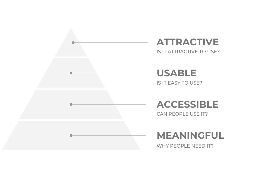
There is not a single definition of what good design, as this would depend on factors such as is you are designing a physical or a digital product. 

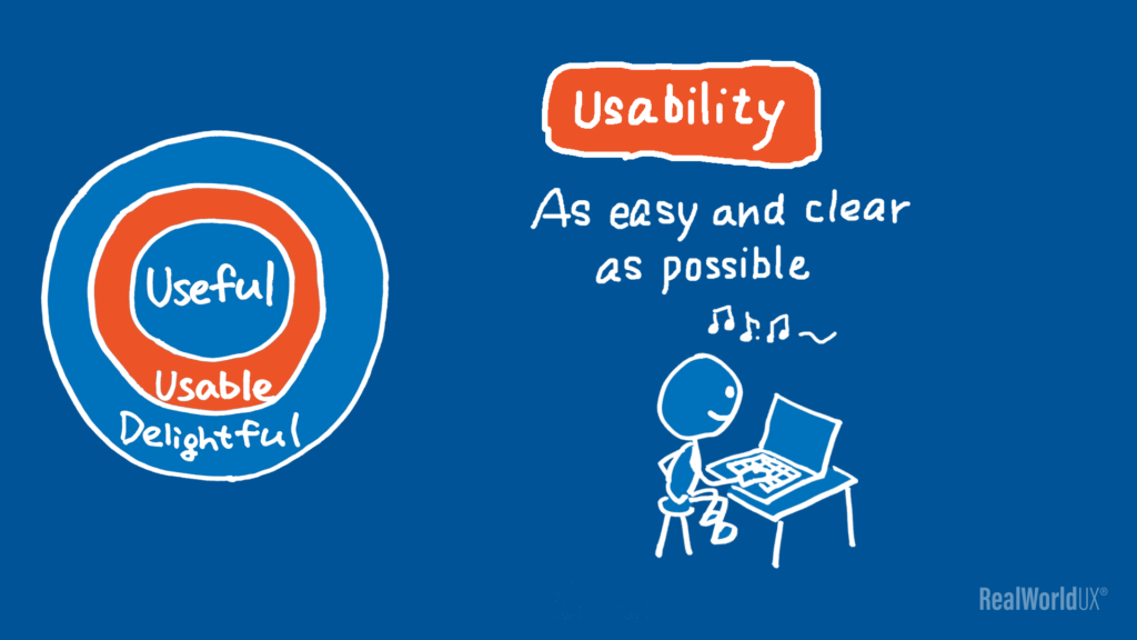
However, there are three designs principles that you should take into consideration if you want your product to be successful:

  1. Usable

Users should be able to learn how to use the product easily.

People use products to solve a problem or to achieve a goal. Your product should be able to help them in complete these tasks without giving them the additional stress of learning how to use your product. 

    1. Aesthetic

    Good design is aesthetically pleasing to look at. In fact, people tend to believe that things that look better will work better — even if they aren’t actually more effective or efficient.

    This phenomenon is called the aesthetic-usability effect and demonstrates that users have a positive emotional response to visual designs. 

           3. The extra mile: Delights the user

      So you already have a product that is both useful and aesthetic and would like to make it stand out from the crowd? 

      Good design brings the user nice surprises. A product that delights users may provide an extra feature that their users didn’t know they needed but they are happy to have it now that they’ve discovered it. 

      Designed by Open Social

      Is my product usable?

      It is important to clarify that not because a product is useful, it means that it is usable. Useful and usable are two terms that are often used in the context of product design, but they refer to different aspects of a product.


      • A product is considered useful if it satisfies a specific need or fulfills a specific purpose. For example, a flashlight is useful because it provides light in dark places.
      • A product is considered usable if it is easy to understand and use by the intended user. For example, a flashlight with a simple on/off switch is usable because it is easy for anyone to operate.

      Therefore, for a product to be successful, it should be both useful and usable. A product that is only useful but not usable will not be popular with users, as they will find it difficult to use. Similarly, a product that is only usable but not useful will not be popular with users as it does not serve any real purpose.

      “Usability is a measure of how well a specific user in a specific context can use a product/design to achieve a defined goal effectively, efficiently, and satisfactorily.”

      • Interaction Design Foundation

      But how can we assess the usability of a product? Performing interviews and testing your product can be very expensive and time consuming. 

      Heuristic evaluation

      One method that is common used by many designers is by performing an Heuristic Evaluation. 

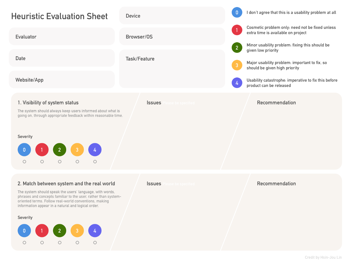
      Heuristic evaluation is a method of usability testing that involves having a small group of experts evaluate a product or interface against a set of predefined usability principles, also known as heuristics. These experts, called evaluators, use their knowledge and experience in human-computer interaction to identify usability problems and provide recommendations for improvement.


      The purpose of heuristic evaluation is to identify and prioritise usability issues in a product or interface early in the design process, before it is tested with actual users. By identifying and addressing these issues early on, developers can save time and resources that would have been spent on redesigning or fixing usability problems later in the development process.


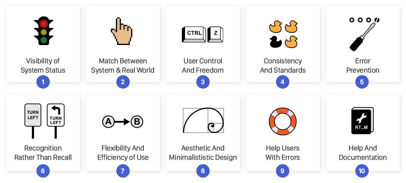
      A common set of heuristics used in heuristic evaluation are Nielsen’s heuristics which are:

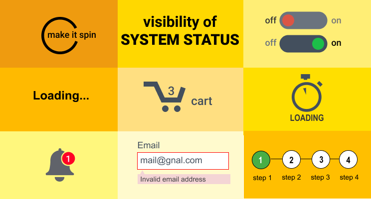
      1. Visibility of system status

      It refers to the idea that users should be able to understand the current state of the system at all times, and that the system should provide clear feedback to the user about any actions they take.


      The system status can be visible through different ways like Progress bars, loaders, notifications, messages, etc. It can be displayed through the use of visual cues, such as highlighting the selected option, or through text messages that confirm an action has been taken.


      For example, if a user clicks on a button to submit a form, the system should provide clear feedback to indicate that the form has been received and is being processed. This can be done through a message that says “Form submitted” or through a visual cue such as a spinning loading icon.


      This heuristic is important because it helps to keep users informed about what is happening with the system and helps to prevent confusion or frustration. It also helps users to understand the outcome of their actions and whether the system is working as expected.

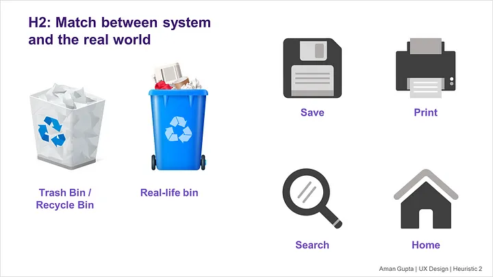
      2. Match between system and the real world

      It refers to the idea that the language, concepts, and metaphors used in the interface should be familiar to users and should match their mental model of the task or problem at hand. This helps users to understand the interface and how to use it more quickly and easily.


      The match between the system and the real world can be achieved in several ways. For example, using real-world metaphors, such as a trash can icon for delete, makes the interface more understandable for users as they already have a mental model of how a trash can works in the real world. Similarly, using natural language in the interface, such as “Save” instead of “Submit” can also make the interface more user-friendly.


      This heuristic is important because it helps to reduce the cognitive load on users, making the interface easier to learn and use. When the interface uses familiar concepts and metaphors, users don’t have to spend time figuring out how to use it, they can focus on completing their task.


      In addition, when the interface matches the user’s mental model of the task, they are more likely to make fewer errors and complete the task faster.

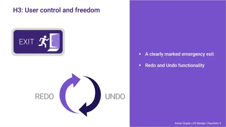
      3. User control and freedom

      It refers to the idea that users should have a sense of control over the system and the ability to undo or redo their actions. It also refers to the ability of users to leave the current task or dialog and return to it later.


      This heuristic is important because it helps to reduce the user’s frustration and anxiety by allowing them to undo any mistakes they may make and to change their mind about a task without losing their work. It also helps users to feel more confident and in control of the system, which can increase their satisfaction with the interface.


      To achieve this heuristic, interfaces should provide clear undo and redo buttons, clear exit and cancel options, and the ability to save progress and return to a task later. For example, in a form-filling process, an interface should have a clear exit button and an option to save the progress and come back to it later.


      Additionally, interfaces should also provide clear feedback on the actions taken by the user, such as confirmation dialogs, progress indicators, and error messages. This will help users understand the effects of their actions and provide them with the information they need to make informed decisions.

      4. Consistency and standards

      It refers to the idea that the interface should be consistent in its layout, design, and behaviour, and that it should adhere to established design standards and conventions. This helps users to understand the interface and how to use it more quickly and easily.


      Consistency can be achieved in different ways such as using similar layouts, similar wording, and similar iconography throughout the interface. This makes it easier for users to predict where they can find information or features and how to perform certain tasks. This is particularly important for repetitive tasks.


      Standards refer to the established conventions and best practices in the industry, such as accessibility guidelines, platform guidelines, and design patterns. Adhering to these standards can help users to understand and use the interface more easily, as they are already familiar with these conventions.


      This heuristic is important because it helps to reduce the cognitive load on users and decrease the chance of errors. When an interface is consistent and follows established standards, users don’t have to spend time figuring out how to use it and can focus on completing their task. Additionally, it also helps users to feel more comfortable and confident using the interface, which can increase their satisfaction.

      5. Error prevention

      It refers to the idea that the interface should be designed to prevent errors from occurring in the first place, rather than just providing ways to recover from them after they occur. This helps users to complete their tasks more efficiently and with fewer errors.

      Error prevention can be achieved in different ways such as:

      1. Validating input: by checking the validity of input data before it is submitted, the interface can prevent errors that would otherwise occur later in the process.
      2. Using clear and simple language: using clear and simple language in the interface can help users understand what they are supposed to do, reducing the chance of errors.
      3. Providing clear feedback: providing clear feedback on the actions taken by the user, such as confirmation dialogs, progress indicators, and error messages, can help users understand the effects of their actions and make informed decisions.
      4. Using default values: providing default values for fields can help users to complete forms more quickly and reduce the chance of errors.

      This heuristic is important because it helps to reduce the number of errors that users make and the time they spend correcting them. Additionally, it also helps users to feel more confident and in control of the system, which can increase their satisfaction with the interface.


      In summary, Error prevention is about designing interfaces with the goal of reducing the number of errors made by the users, by making it harder for them to make mistakes, and easier for them to understand and correct any errors that may happen.

      6. Recognition rather than recall

      It refers to the idea that the interface should make it easy for users to recognise the information or options they need, rather than requiring them to remember and recall it.

      Recognition is a cognitive process that allows people to identify something based on prior knowledge or experience. It is generally considered to be easier and faster than recall, which is the cognitive process of retrieving information from memory.

      The recognition rather than recall heuristic can be achieved in different ways such ass:

      1. Providing clear labels and icons: by providing clear and informative labels and icons, the interface makes it easy for users to recognize the information or options they need.
      2. Using natural language: using natural language in the interface makes it easier for users to understand the information and options presented to them.
      3. Consistency: providing consistency in the layout, design, and behavior of the interface makes it easier for users to recognize the information and options they need.

      This heuristic is important because it helps to reduce the cognitive load on users, making the interface easier to learn and use. When the interface is designed to support recognition, users don’t have to spend time trying to recall information or options, they can focus on completing their task. Additionally, it also helps users to feel more comfortable and confident using the interface, which can increase their satisfaction.


      In summary, Recognition rather than recall heuristic is about designing interfaces that make it easy for users to recognise the information or options they need, rather than requiring them to remember and recall it.

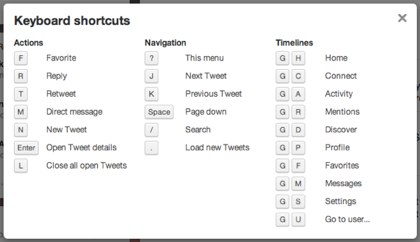
      7. Flexibility and efficiency of use

      It refers to the idea that the interface should be designed to support different ways of working and allow users to tailor it to their individual needs, while also being efficient and easy to use.


      Flexibility refers to the ability of the interface to adapt to different user needs and preferences. This can be achieved by providing users with options to customise the interface, such as changing the layout or colour scheme, or by providing different ways to perform a task.


      Efficiency refers to the ability of the interface to allow users to complete their tasks quickly and easily. This can be achieved by providing clear and direct access to the information and options they need, reducing the number of steps required to complete a task, and providing clear feedback on the actions taken by the user.


      This heuristic is important because it helps to increase the user’s satisfaction with the interface by allowing them to tailor it to their individual needs, while also making it more efficient and easy to use. When the interface is flexible and efficient, users can complete their tasks more quickly and with fewer errors, which can increase their satisfaction and overall productivity.


      In summary, Flexibility and efficiency of use heuristic is about designing interfaces that support different ways of working, allow users to tailor it to their individual needs, while also being efficient and easy to use.

      8. Aesthetic and minimalist design

      It refers to the idea that the interface should be visually pleasing and visually simple, with a clean and uncluttered layout.


      Aesthetic design refers to the visual appeal of the interface, including the use of colour, typography, and imagery. A well-designed interface should be visually pleasing and create a positive user experience.


      Minimalist design refers to the use of a minimal amount of elements in the interface, with a focus on simplicity and functionality. The goal is to create a clean and uncluttered layout that makes it easy for users to understand and use the interface.


      This heuristic is important because it helps to increase the user’s satisfaction with the interface by creating a visually pleasing and visually simple design. When the interface is aesthetically pleasing, users are more likely to have a positive perception of the product, and when it is minimalist, users are less likely to feel overwhelmed or confused by the interface. Additionally, a minimalist design can make it more efficient to use and understand.


      In summary, Aesthetic and minimalist design heuristic is about designing interfaces that are visually pleasing, with a clean and uncluttered layout, and

      9. Help users recognize, diagnose, and recover from errors

      It refers to the idea that the interface should be designed to help users identify, understand, and recover from errors that may occur while they are using the system.

      • Helping users to recognise errors: The interface should provide clear and informative error messages that help users understand what went wrong and what they need to do to fix the problem. The error message should be specific, actionable and in plain language.
      • Helping users to diagnose errors: The interface should provide additional information or context to help users understand the cause of the error and how to fix it. For example, providing a link to additional help or documentation can help users diagnose the problem.
      • Helping users to recover from errors: The interface should provide users with clear and direct ways to recover from errors, such as undo and redo buttons, or clear exit and cancel options. It should also provide clear feedback on the actions taken by the user, such as confirmation dialogs, progress indicators, and error messages

      This heuristic is important because it helps to reduce the frustration and anxiety that users may feel when they encounter errors, and it also helps to prevent errors from happening in the first place by providing clear and informative error messages. Additionally, by providing clear and direct ways to recover from errors, it helps users to feel more confident and in control of the system, which can increase their satisfaction with the interface.


      In summary, Help users recognise, diagnose, and recover from errors heuristic is about designing interfaces that help users identify, understand, and recover from errors that may occur while they are using the system.

      10. Help and documentation

      It refers to the idea that the interface should be designed to provide users with access to the information and assistance they need to learn and use the system effectively.


      Help refers to the assistance provided by the interface itself, such as tooltips, context-sensitive help, or online tutorials. These types of help are usually integrated into the interface and are easily accessible to users as they work.


      Documentation refers to the additional information and guidance provided outside of the interface, such as user manuals, online help, or knowledge bases. This type of help is usually provided in a separate format and is intended to provide more detailed information and guidance.


      This heuristic is important because it helps users to understand and use the system more effectively, and it also helps to reduce the frustration and anxiety that users may feel when they encounter problems or have questions. By providing clear and accessible help and documentation, the interface can help users to learn and use the system more quickly and easily.


      In summary, Help and documentation heuristic is about designing interfaces that provide users with access to the information and assistance they need to learn and use the system effectively, including in-app help and additional information and guidance.

      Photo credit: pinterest.com Photo credit: mailchimp.com

      How to perform a Heuristic Evaluation?

      A Heuristic evaluation is a usability inspection method where experts evaluate a user interface against a set of predefined usability principles, also known as heuristics. Here are the general steps to perform a heuristic evaluation:

      1. Define the usability expert: select a professional who specialises in the study and design of products and interfaces that are easy and efficient to use, so that they can ensure that your product is designed in a way that meets the needs and expectations of the people who use it.
      2. Select the heuristics: Choose a set of heuristics that are relevant to the user interface being evaluated. Common sets of heuristics include Nielsen’s heuristics, ISO 9241-11, and the specific heuristics relevant to the context of the product.
      3. Prepare the evaluation materials: Prepare all the necessary materials for the evaluation, such as screen shots, task scenarios, and access to the product or interface being evaluated.
      4. Conduct the evaluation: Each team member evaluates the user interface independently, using the heuristics as a guide. They should take notes and provide feedback on any issues or problems they encounter.
      5. Summarise the findings: After the evaluations are complete, the team should meet to discuss the findings and identify any patterns or common issues.
      6. Create a report: The findings should be documented in a report that includes an overview of the evaluation process, a summary of the findings, and specific recommendations for improvement.
      7. Communicate the findings: Share the report with the design and development team, stakeholders, and other relevant parties, and discuss the findings and recommendations with them.

      What is a UX Audit?

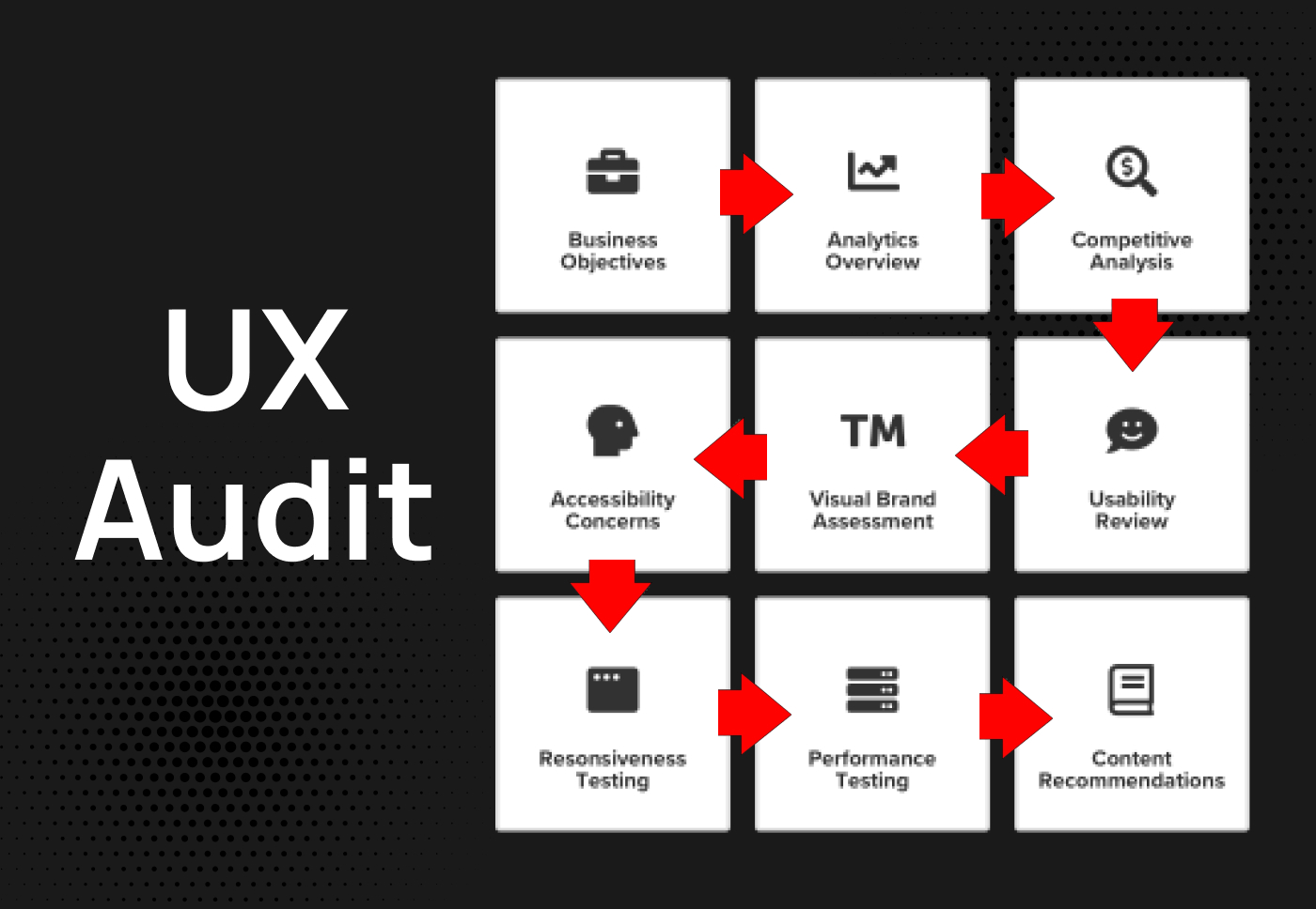
      A UX (user experience) audit is a process of evaluating the usability, accessibility, and overall quality of a product or service from the perspective of its users. It involves a thorough examination of the product’s design, functionality, and content, with the goal of identifying any issues or problems that may be impacting the user’s experience.


      The UX audit process typically includes a combination of research methods, such as user interviews, surveys, and usability testing, as well as an analysis of the product’s design and content. The results of the audit are then used to create a report that highlights the key issues and provides recommendations for improvement.


      The purpose of a UX audit is to identify areas for improvement in the product or service, and provide actionable insights to help the design and development teams to address these issues. The audit can help to identify any issues that may be impacting the user’s experience, such as poor navigation, confusing content, or a lack of accessibility.


      An UX audit can be applied to a wide range of digital products such as websites, mobile apps, software, and other interactive digital experiences. It can also be applied to non-digital products, in a similar way that one can evaluate physical products usability.


      In summary, a UX audit is a comprehensive evaluation of the user experience of a product or service, with the goal of identifying any issues or problems that may be impacting the user’s experience and providing recommendations for improvement.

      What’s the difference between Heuristic Evaluation and a UX Audit?

      Heuristic evaluation and UX audit are both usability inspection methods that are used to evaluate the quality of a product or service from the perspective of its users. However, there are some key differences between the two methods:

      • Heuristic evaluation: Heuristic evaluation is a method where experts evaluate a user interface against a set of predefined usability principles, also known as heuristics. The goal of a heuristic evaluation is to identify any issues or problems with the user interface that may be impacting the user’s experience, and to provide recommendations for improvement. Heuristic evaluations are typically performed by a small team of experts in human-computer interaction and usability.
      • UX Audit: A UX (user experience) audit is a more comprehensive evaluation of the user experience of a product or service. It involves a thorough examination of the product’s design, functionality, and content, with the goal of identifying any issues or problems that may be impacting the user’s experience. The UX audit process typically includes a combination of research methods, such as user interviews, surveys, and usability testing, as well as an analysis of the product’s design and content. The goal of a UX audit is to identify areas for improvement in the product or service, and to provide actionable insights to help the design and development teams address these issues.

      How can a User Experience Designer help me improve my product?

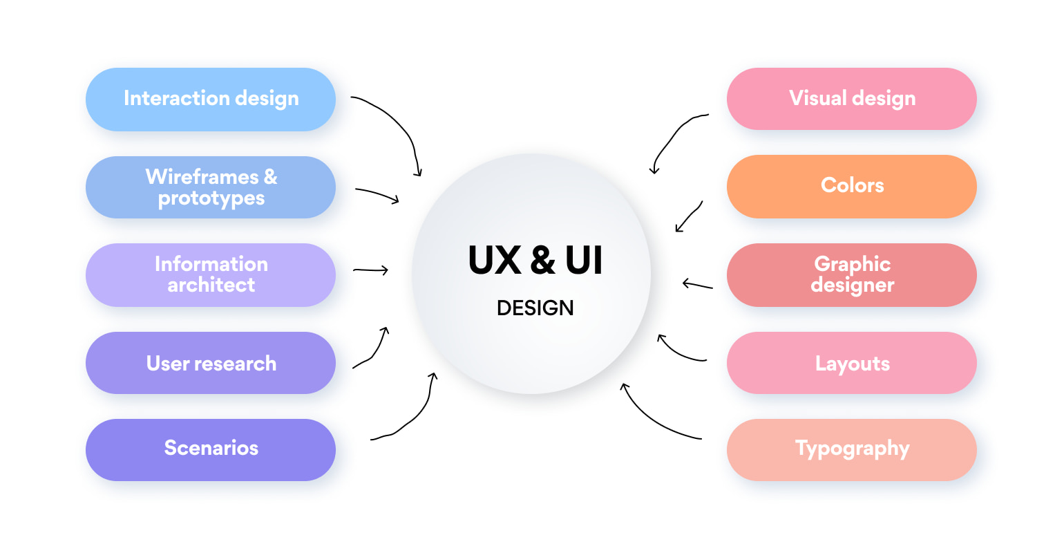
      A UX (user experience) designer can help you improve your product by applying user-centered design principles and techniques to the design and development process. Here are some ways a UX designer can help you improve your product:

      1. User research: A UX designer can conduct user research to understand the needs, goals, and behaviours of your target audience. This information can be used to inform the design of the product and ensure that it meets the needs of your users.
      2. User testing: A UX designer can conduct user testing to evaluate the usability and effectiveness of the product. This can help to identify any issues or problems with the user interface or functionality, and provide recommendations for improvement.
      3. Design: A UX designer can design the user interface and interaction of your product, taking into account the needs and goals of your users. This can help to ensure that the product is easy to use and understand, and that it supports the users’ tasks and goals.
      4. Usability evaluation: A UX designer can conduct usability evaluations, such as heuristic evaluations, to identify usability issues and provide recommendations for improvement.
      5. Accessibility: A UX designer can ensure that the product is accessible to users with disabilities, and that it meets the relevant accessibility guidelines and standards.
      6. Iteration: A UX designer can work with you in an iterative design process, where they can make adjustments and improvements to the product based on user feedback, research, and testing.

      Overall, a UX designer can help you improve your product by applying user-centered design principles and techniques, and providing you with the data and insights you need to make informed decisions about the design and development of your product.

      More to explore

      Giftano-for-business-cover

      UX|UI Design

      I bring products from idea to development using a User Center Design approach.
      Cover-Search Page

      UX Audits

      I help businesses improve their products usability and performance with a UX Audit.
      Wordpress-dev

      Website Development

      I build websites using WordPress/Webflow for small businesses and bloggers.

      © 2022 Andrea Viflor

      Andrea Viflor | User Experience Designer