


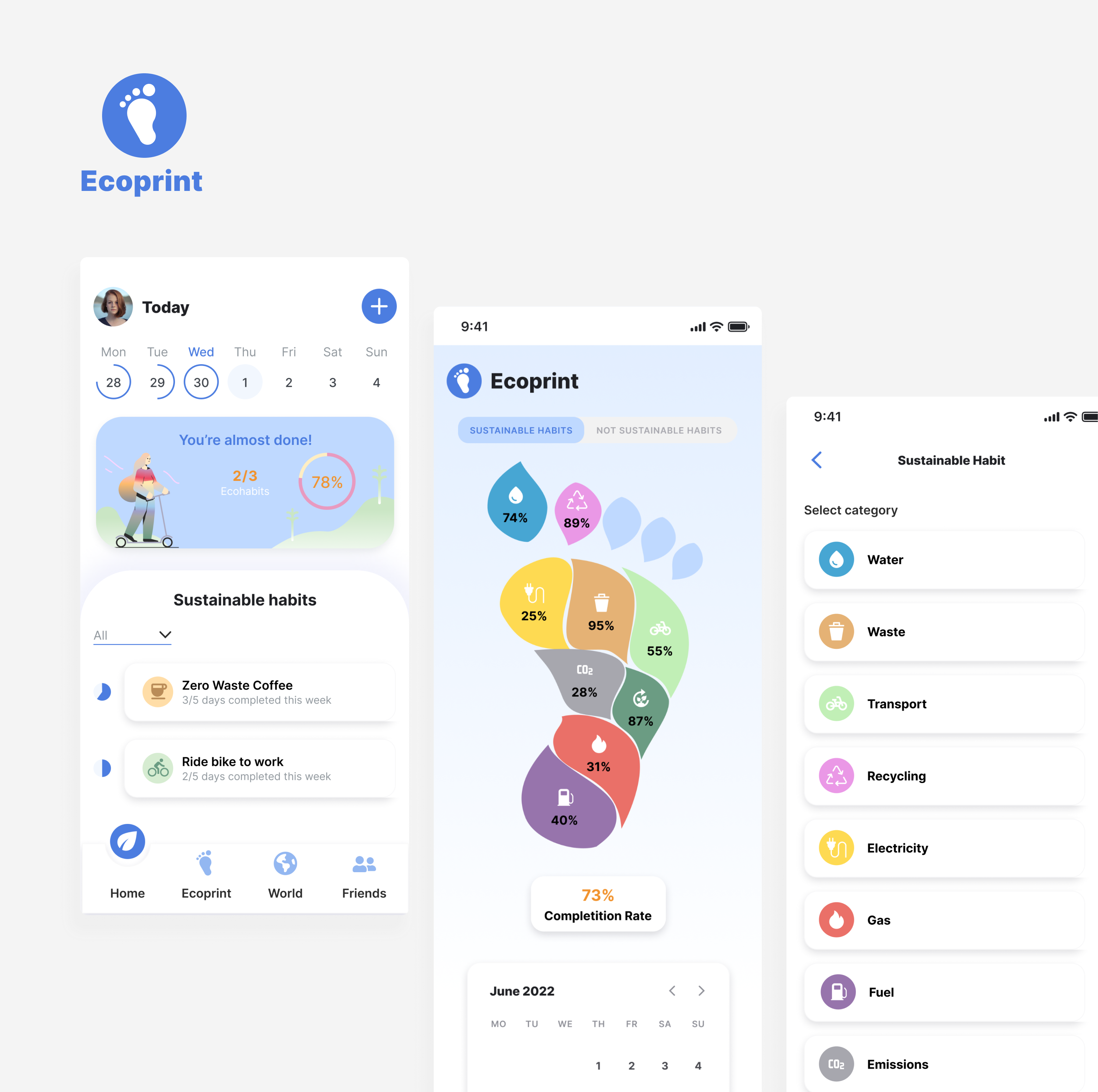
An app to cope with eco-anxiety
I designed Ecoprint, a mobile app that helps users to take action against climate change by providing them with easy-to-follow daily tasks.
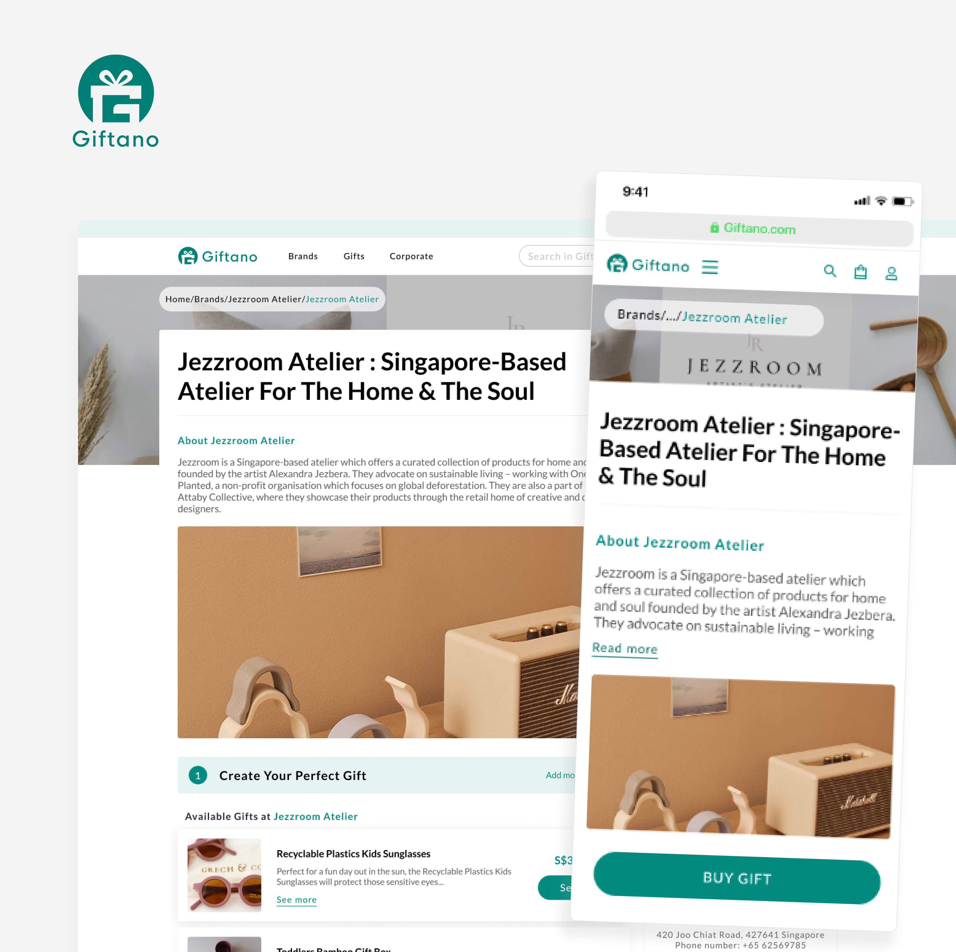
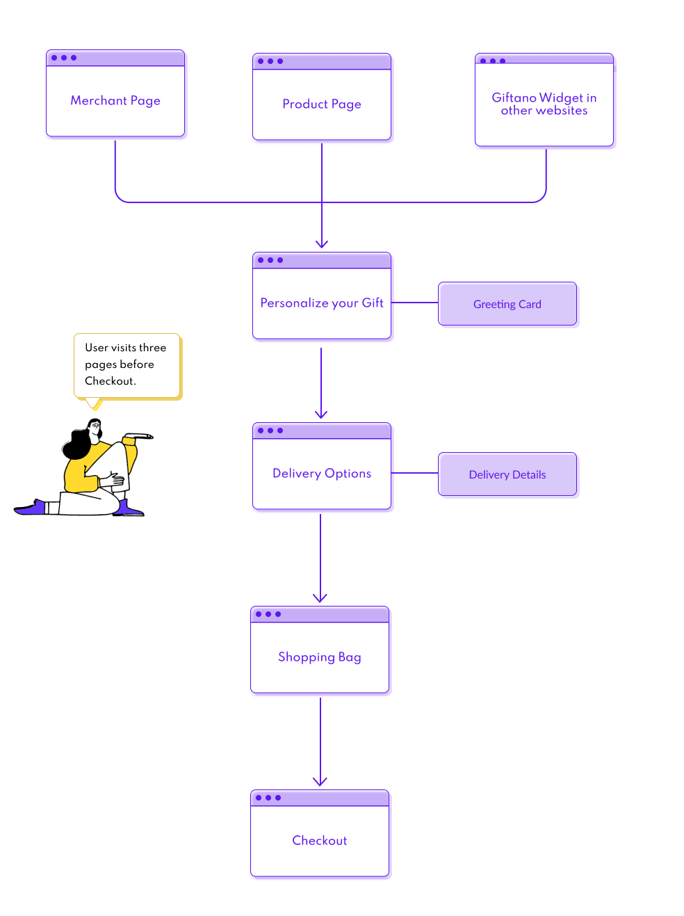
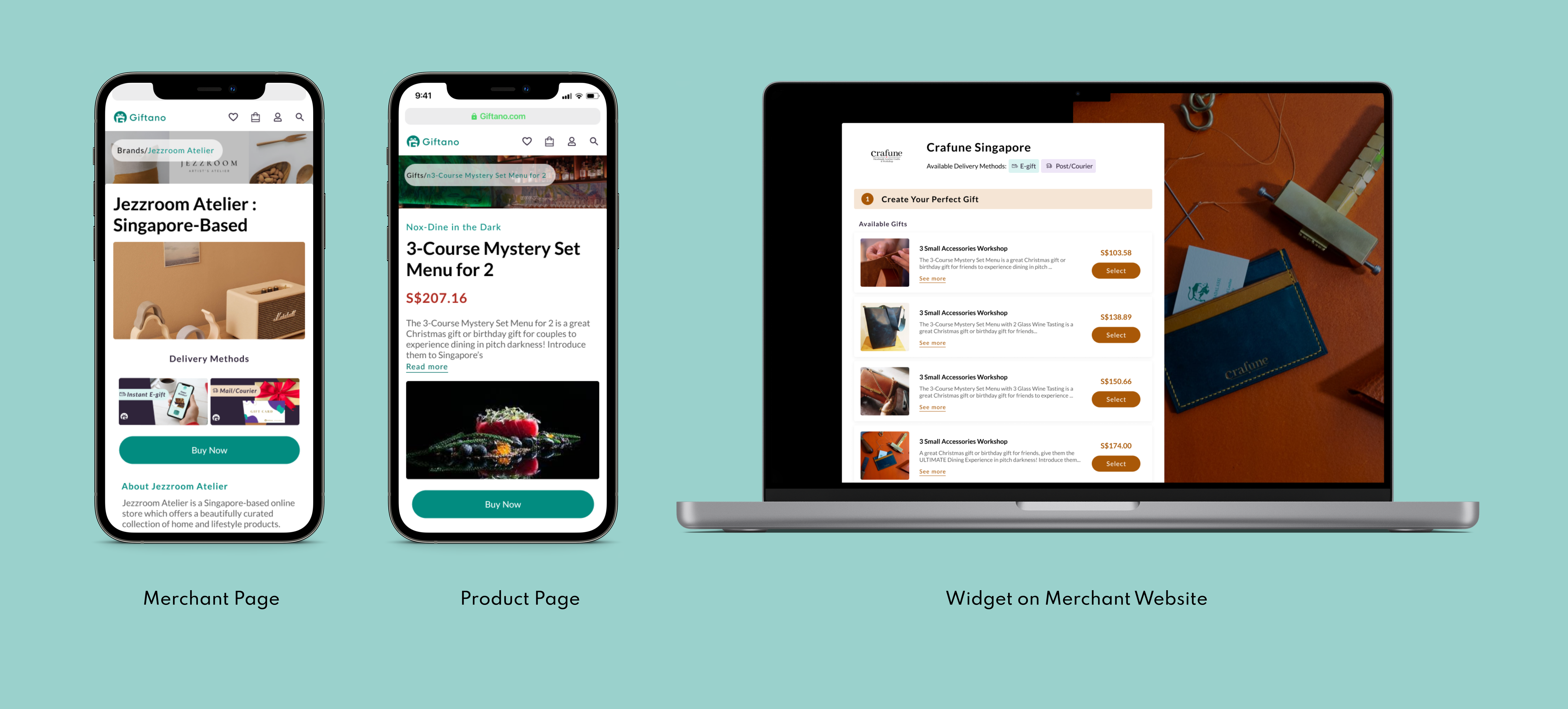
A simplified purchasing process
I helped redesign the Merchant & Product page at Giftano to help users go through the purchasing process in a much faster and enjoyable way.
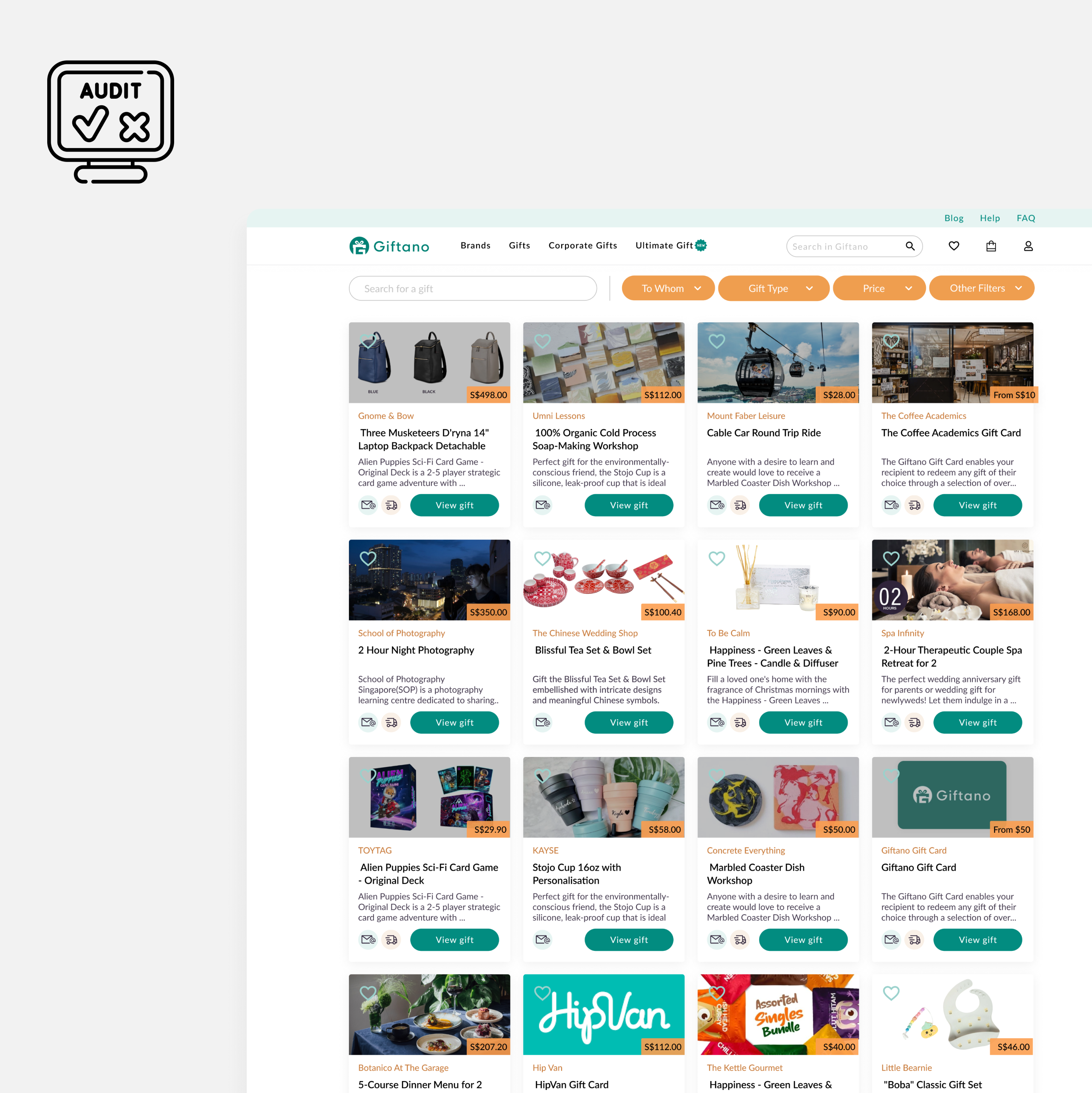
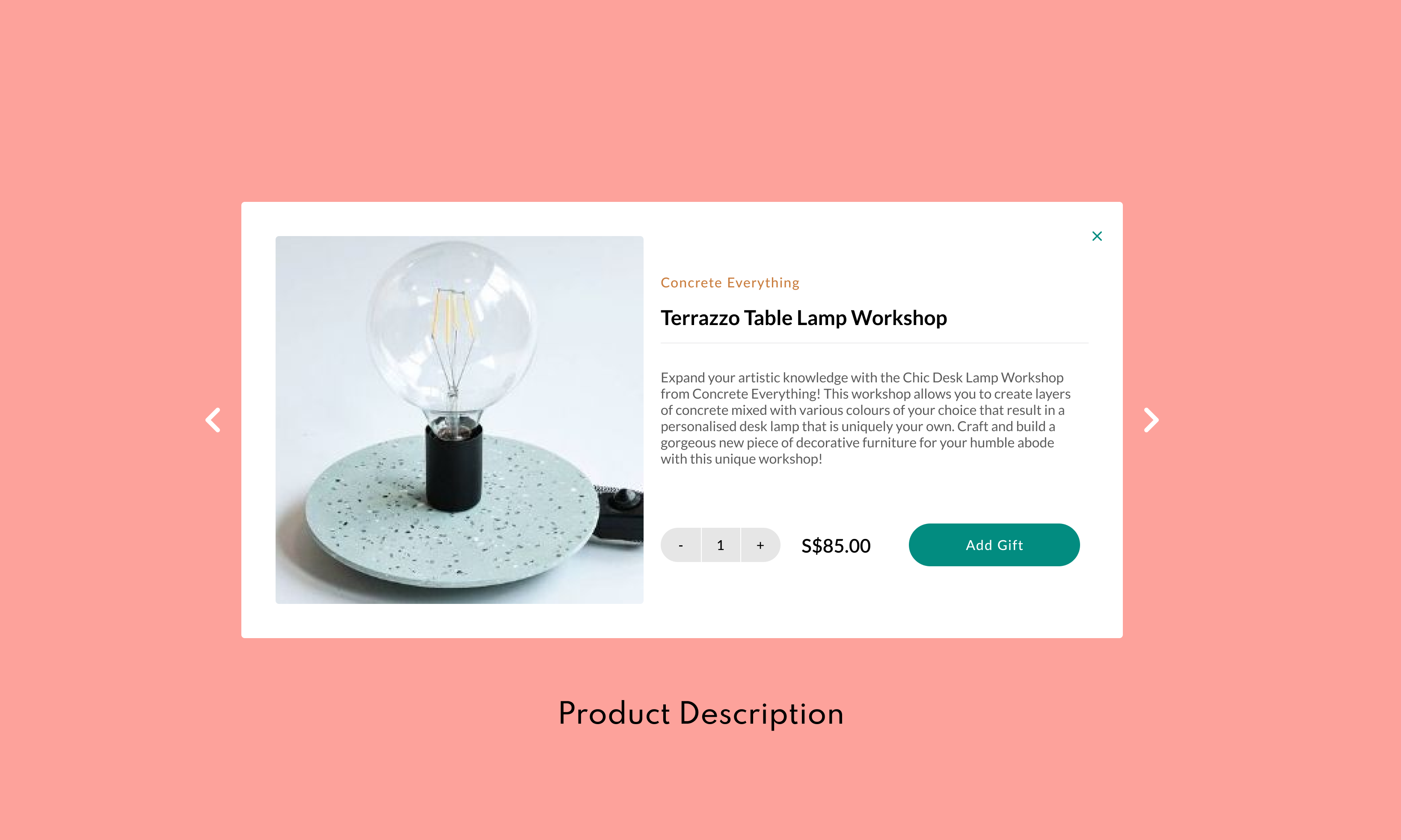
An easier-to-use marketplace
Through an UX Audit of Giftano Marketplace I was able to identify and come up with solutions for a more intuitive shopping experience.